|
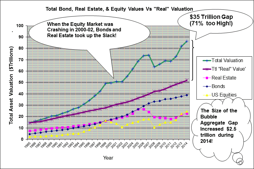
First is a summary graph of the major asset categories.
This graph indicates the "Perceived" Market valuations for Bonds, Real Estate, and Equities
individually (the bottom three lines). Then, the top line is a summation of the three along with a line below it
showing a total of the "Real" valuations for comparison. Note the $35 Trillion gap (BUBBLES...)...!
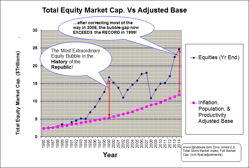
Next is a graph of the "Perceived" total U.S. Equity
Market valuation compared to the "Real" valuation.
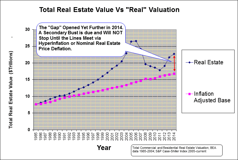
Next is a graph of the total "Perceived" Market valuation
of all U.S. Commercial and Residential Real Estate compared to the "Real" valuation.
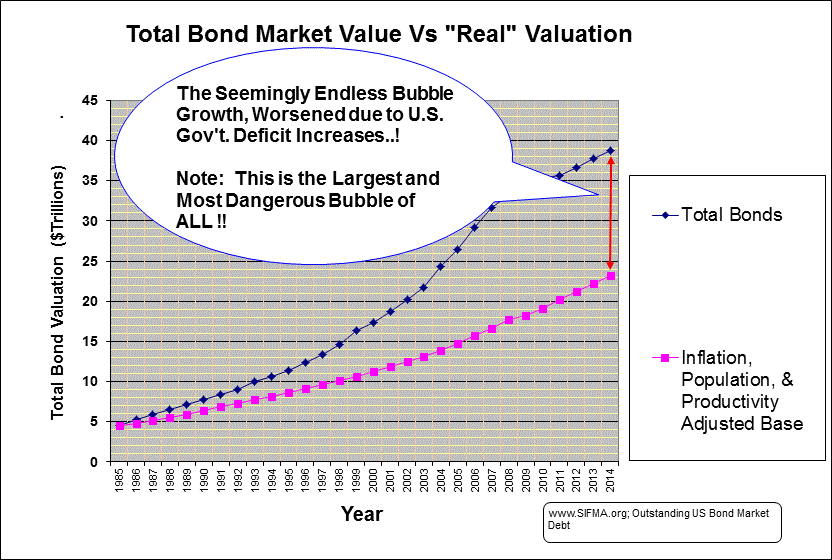
Finally, a graph showing the total "Perceived" U.S. Bond Market
valuation vs the "Real" valuation.
|